Geopolitical Data Analysis

Gallery
Interactive Map of Afghanistan
The map shows the political violence in Afghanistan. It is an interactive map made by Plotly. You can download the html file from the blog post about Afghanistan War.
.png)
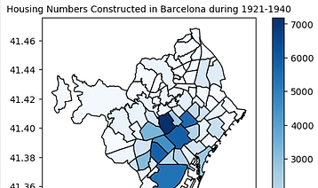
Maps of Building Ages in Barcelona
To assume the building project by Franco Regime, I made a map of Barcelona based of the year of building construction. It uncovered the hidden urban extension project in Franco era.
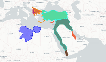
Historic Borders of Ottoman Empire
This is a multi-layered interactive map made by Geopandas and Folium. It shows the historic change of the borders of Ottoman empire and its successor Turkey.
Choropleth Map of Pakistani Diaspora
This map is about the distribution of Pakistani Diaspora in the world. It is made by Plotly.
_edited.jpg)
Choropleth Map of Fatalities in Syria
It shows the fatalities of each region in the Syrian War since 2017. This choropleth map was made by Geopandas .explore() method.
